The story behind Andron
It actually began with my grandmother. She gave me children’s books from the 1920s, printed in Sütterlin, when I was a little boy. The postcards sended to me were written in her usual oldstyle German Kurrentschrift and, in order to make me fit to read it, she showed me how to write it. Later I read more old books – bulky Western novels in particular – which were printed in Fraktur. For me it was as normal as reading texts in Roman, when I was 12.
As I grew older I attended graphic design evening classes for pupils at the art academy. Here I stumbled into ‘font design’ for the very first time: we were given black paper, a pointed knife and the task to cut out letters of a sans type.
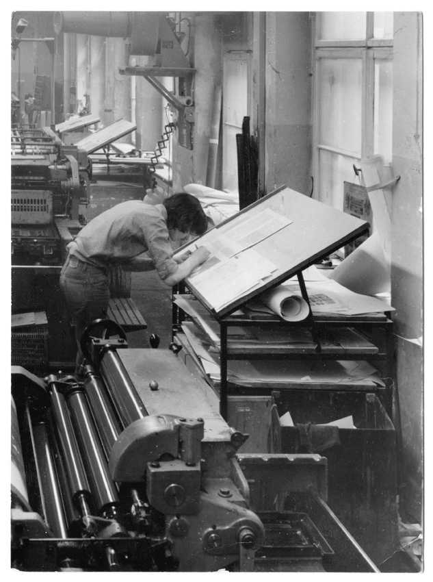
At the age of 16 I became an apprentice to the Offizin Andersen Nexö printing house in Leipzig, the successor of the former Offizin Haag Drugulin, a company famous in former days for their expertise in typesetting and printing of foreign and ancient languages. For about five years I had lead type (e.g. Garamond, Dante, Bodoni etcª) in my fingers every day.
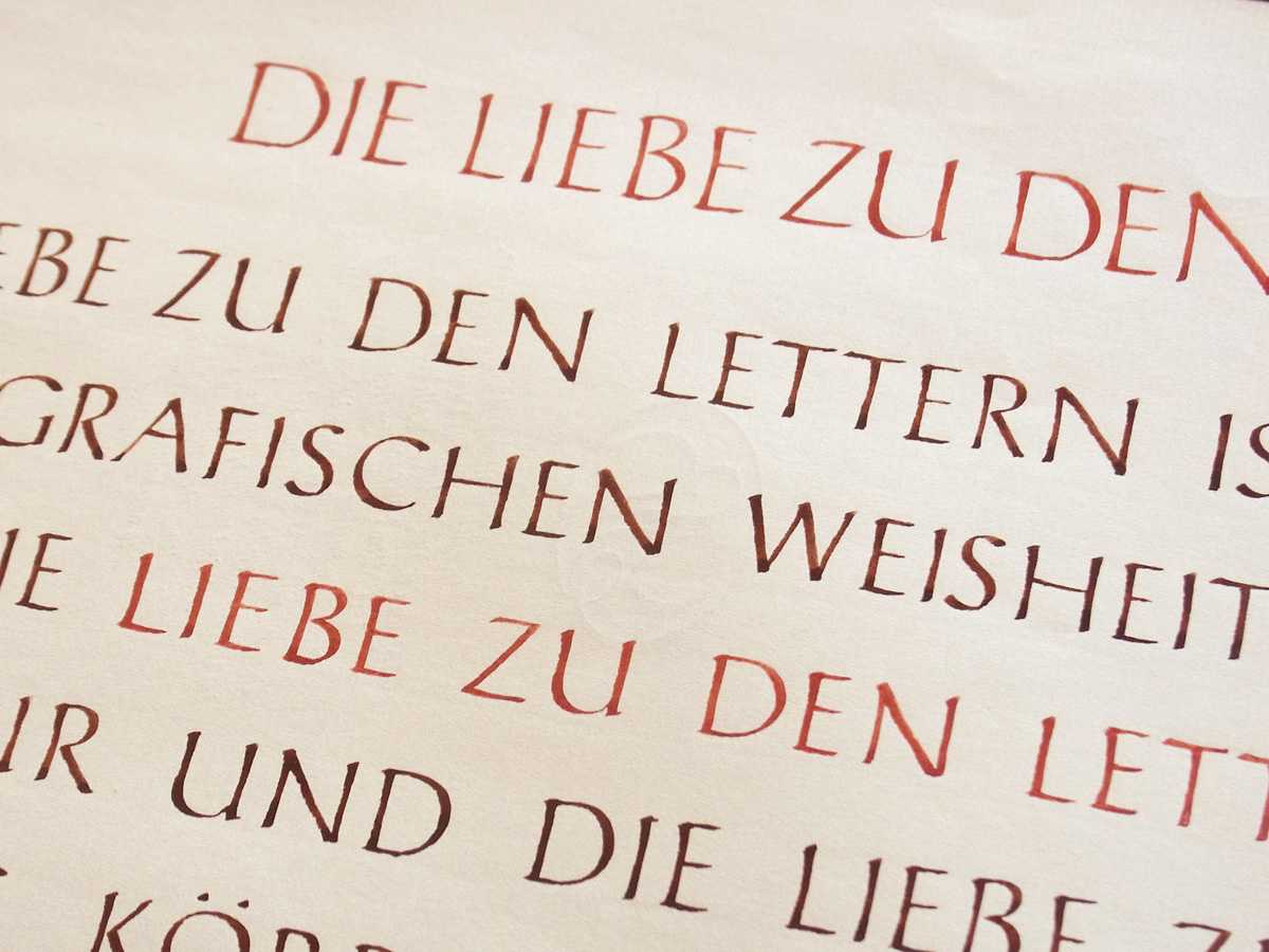
After my time as a letterpress printer, I began full time studies at the Hochschule für Grafik und Buchkunst. Formal writing was a core part of the education schedule during the first two years. We had about 12 to 20 hours of practical exercise with the steel pen every week. We trained to write Capitalis, minuscules and Italics endlessly. My teacher was Hildegard Korger, to her I owe mainly to having some idea about what lettering actually is. We also drew complete sans and serifed capital alphabets, 3 inches in height, with brush and ink. When there was a flaw in some shape of 0.2 or 0.1 millimetres, our teacher spotted it from a three-metres distance and we had to correct it or draw the entire letter again.
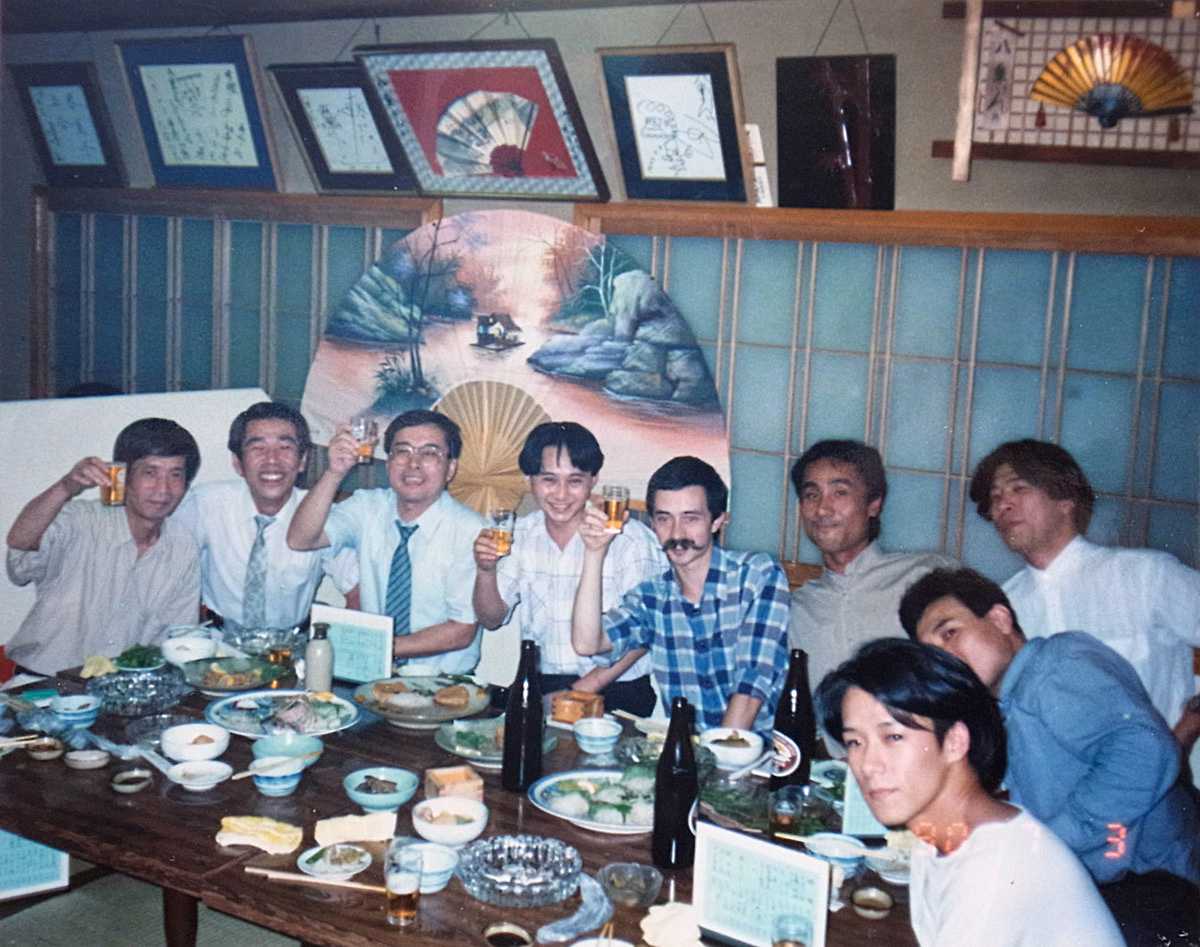
Towards the end of my studies in Leipzig I happened to participate in a postal stamp design contest held by the Ministry of Post and Telecommunication of Japan. It was in autumn 1989, when then eastern Germany – and Leipzig in particular – was the hotspot of political turmoil which led to German reunification. When I drew my naïve calligraphic contribution for Tokyo I was still a GDR citizen not allowed to travel freely anywhere. When I got the notification from Tokyo a few months later that I would get awarded for my design, the communist regime had just collapsed and I was free to travel to the award ceremony in Tokyo. Once in Japan and considering this almost unique opportunity, I invested the prize money in a three-month sabbatical in order to see and to learn as much as I could, in this fascinating country.
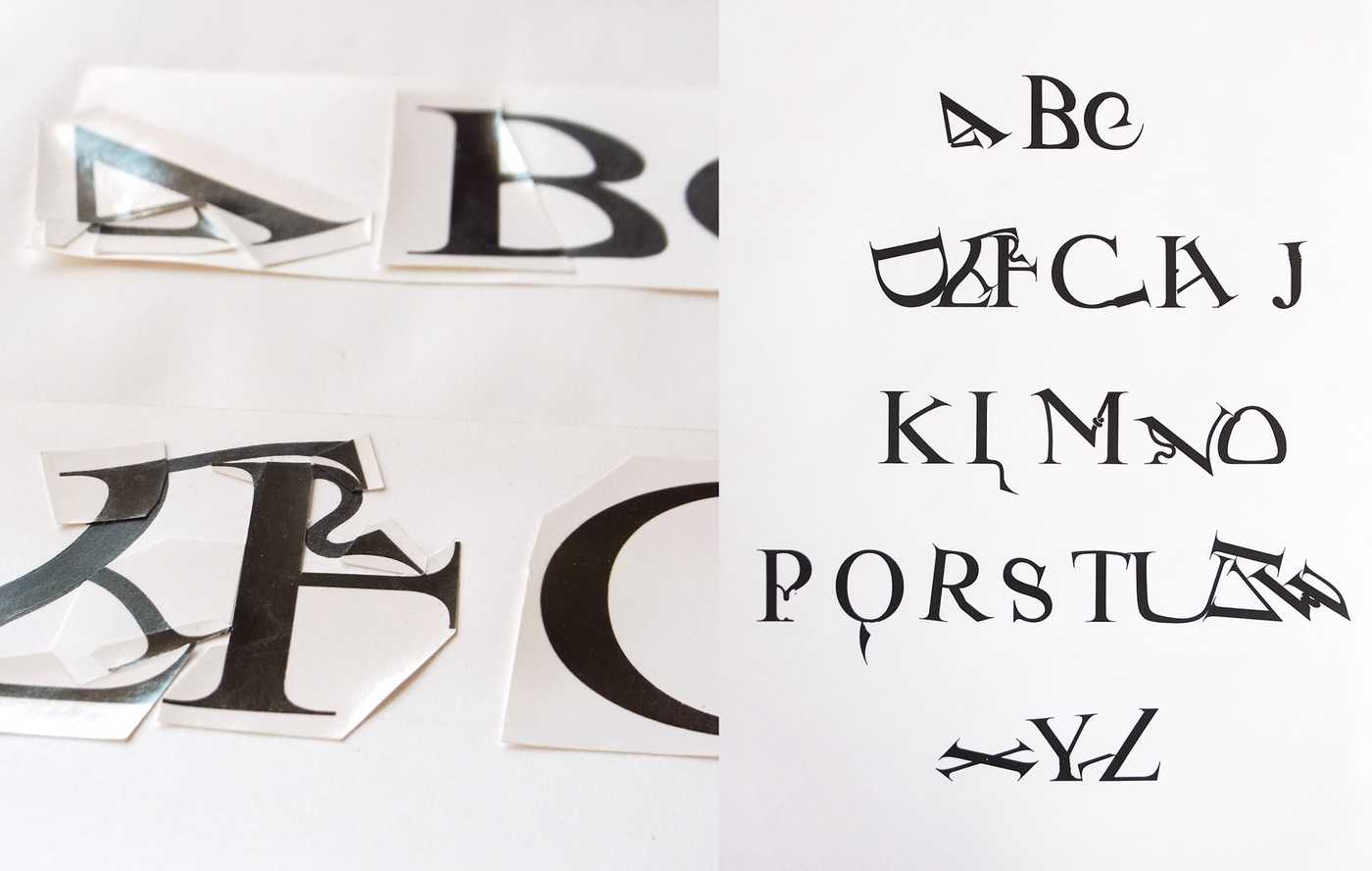
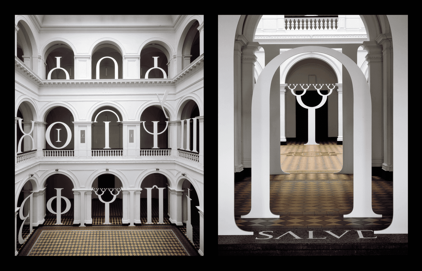
The following year I realised my diploma project at the academy in Leipzig, a three-storey high scenic installation of fantasy letterforms which I cut by hand entirely.
In 1993 I moved to London to complete my studies with a one-year postgraduate enrollment at the Royal College of Art. During this time I mainly studied classical architecture. While still in London, I was informed that my contribution to an urban design contest had been elected for realisation; a few years later the Nikolai column memorial was built in the heart of Leipzig, to commemorate the peaceful revolution of 1989.
The photo series of my diploma project (photographers: Matthias Hoch and Matthias Knoch) was awarded ‘for typographic excellence’ by the Type Directors Club of New York in 1994. In that same year, back in Germany, I started my own design business. It was the jolly old days of the early Macintoshs – and of Fontographer. In the mid-90ies I started to design my first digital fonts which were just ornament and dingbats fonts. It was a thrilling moment when I first watched my own glyphs running into text on screen, but I still had reservations about doing actual typeface fonts, due to a lack of experience in that field.
However, not much later I wanted to know and so I started my first attempt on digital letters – with serifs. They looked terrible. But after a lot of iterations I got the hang of it and, steadily, a text face emerged from my countless hours of labour, which slowly became a sort of type I had been visioning and which I myself would want to use for actual projects. Since I worked on commissioned graphic and editorial design projects all the time, I had ample opportunity to test my fonts with actual settings.
At this time my study beared the name ‘Andron’, a reference to the name of the ancient greek symposion room where the gents used to gather for dinners and discussions – and since that very room was its place of origin, the expression became the name of the typeface I was working on.

In 2003 I delivered the first presentation of Andron at a conference. The basic styles had been completed, more or less; I had worked on the Greek, Cyrillic, Coptic, Gothic, Irish and Anglosaxon fonts as well as the fundamental middle-case concept and Hundreds of special characters of various subjects.
In 2004 the renowned Gutenberg-Jahrbuch chose my new typeface for the composing of two annuals. This offered me the opportunity to publish an introduction article about Andron and the multi-script concept behind it. The work progressed further and in 2005 I introduced a paper upon special Latin abbreviation characters to Deborah Anderson, researcher at UC Berkeley, California. She suggested approaching Prof. Odd Einar Haugen from Bergen University, who networked at that time towards the setup of a special academic initiative, the Medieval Unicode Font Initiative. I was invited to participate in the 2005 MUFI meeting in Lisbon and it was there that my long-lasting international cooperation with linguists and medievalists commenced. Andron became a core asset in the works of MUFI and further meetings were held the following years. Other conference presentations about Andron took place in 2005 in Helsinki and Munich, 2006 in Berlin and 2007 in Saloniki, where I had the opportunity to study Greek in its place and to have discussions with Manolis Savidis, a specialist in Greek typography.
2007 was also the year when I completed fonts of three ancient Caucasian scripts, commissioned by Prof. Jost Gippert (Frankfurt University), of which Albanian, only recently discovered, saw its all-time font premiere in the digital sphere and was used for the first edition of manuscripts found on Mt. Sinai and in Vienna.
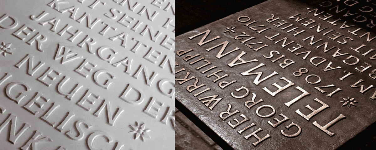
At this time Andron became a sought-after typeface among Scandinavian institutions in particular, such as the Rijksarchivet in Oslo, the University of Bergen or the branches of the Arnamagnæanean Institute in Reykjavík and Copenhagen. The close cooperation with the MUFI specialists resulted in a development of Andron which made it neatly suitable for linguistic and medieval studies. My expertise in Runic design led to a long-term relationship with Prof. Wilhelm Heizmann and his team from Munich University, for whom I designed special Runic character sets.
My ongoing intense study of special characters of all kinds inspired more elaborate works upon metrical and monetary signs – and guided me towards the issue of the German letter ß, which seemed to exist as a lowercase letter only. I was appointed to the German DIN standardisation body by the Burg Giebichenstein art academy in Halle (where I was teaching typography), conducted further investigations on that topic and finally presented a proposal to the Unicode/ISO workgroup meeting in Frankfurt on April 27, 2007, when the capital letter Eszett was accepted to the Unicode Standard officially. Since then the much-debated new character has inspired numerous type designers throughout the world and had acquired a wide acceptance among type professionals and aficionados alike.
The following years Andron saw a steady development and growth, both in terms of the contents of the fonts and the scope of clients.
In 2011 I had the privilege to meet Prof. Joel W. Fredell of Southeastern Louisiana University and his colleagues at a conference in Würzburg. He and his team had created a viable webfont implementation of Andron for a historic online edition project in cooperation with the British Library, for the very first time. We had a most inspiring conversation about the perspective of webfont technology in relation to humanities scholarship and possible typographic solutions in that field.
From 2012 onwards I was commissioned a specific Andron character set for the Dania dialect notation, by the University of Copenhagen.
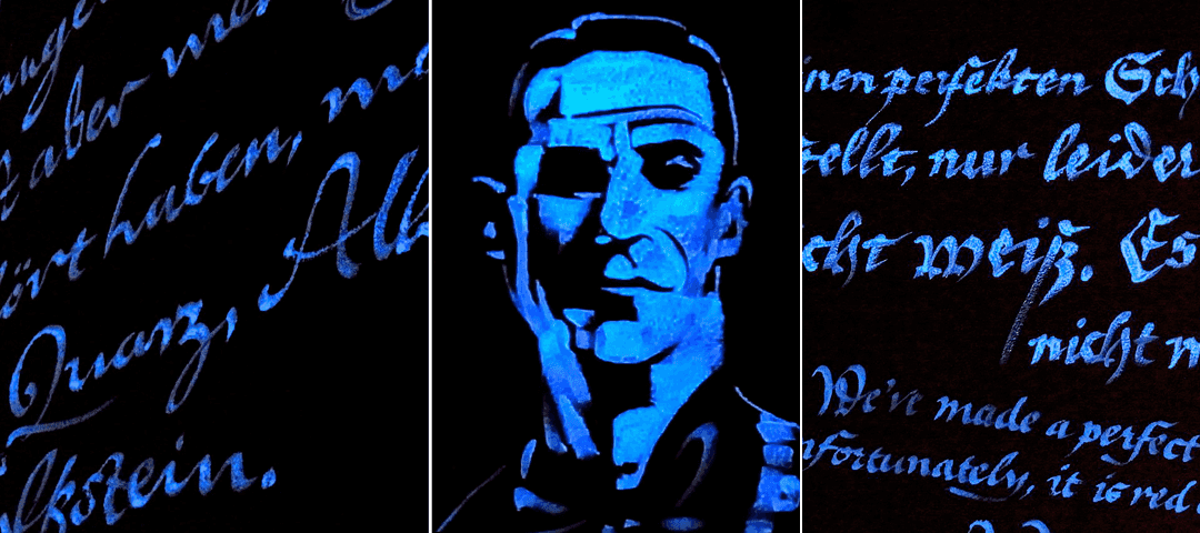
The continuing development of Andron was the background of further conference presentations 2013 in Tours (together with Odd Einar Haugen), 2014 in Odense and 2015 at the Bibliothèque nationale de France in Paris.
Around the year 2019 the amount of glyphs in the Andron Mega package crossed the 14,000 threshold.
Today the users of Andron are prolific editorial designers, acknowledged scientific authors and scholars of many subjects; universities, institutes and specialized publishing houses throughout Europe and America, but also in Israel and other countries. The long-lasting success of Andron led to the conclusion that, with the introduction of a new webfont product, the state of online scholarly publishing can be pushed further towards new standards of editorial quality in the 21st century.