About Andron
It has been my idea of a really versatile text face right from the beginning, to combine a very comprehensive character repertoire with the best possible typographic craftsmanship and design choices. Although a genuine new design in its own right, the informed eye will detect that Andron owes much to the Bembonian tradition of type design, which relation is anything but trivial. Many editorial designers consider the Venetian heritage of Latin type casting the most precious one, to the day.
What Andron is made for
The Andron typeface family is a true work horse as a body text face. Its excellent typographic quality makes it especially suitable for bulky volumes and very extensive text corpora. Andron’s sophisticated design causes a very good-looking text setting; but, moreover it secures the best possible legibility which is indispensable when studying large amounts of text intensely. Therefore, Andron is the first choice for editors, scholars, publishers and academic bodies around the world since many years, when a real robust typographic basis for demanding editorial projects is called for. Andron’s typographic quality copes with the best specimen of lead type printing. Its vast character coverage makes it even more eligible for the most ambitious editions, especially in the field of the humanities and language studies.
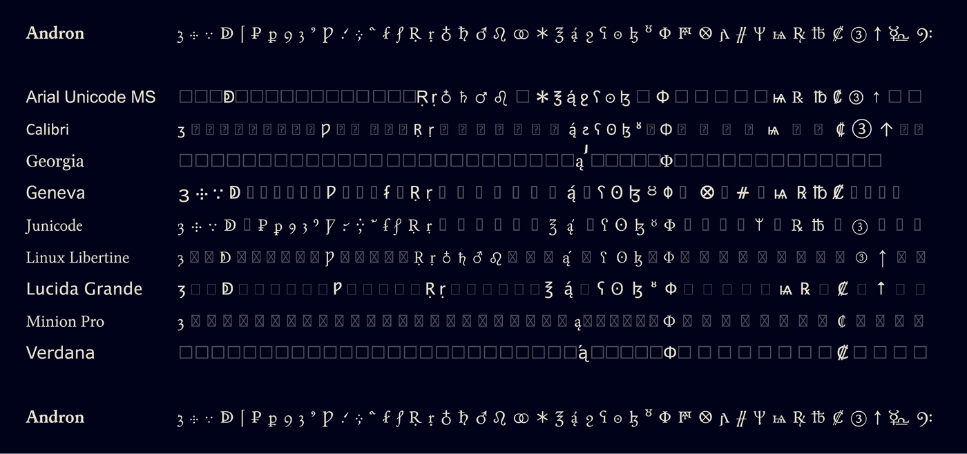
Andron in comparison with other typefaces
Most of the typefaces available today which are designed well usually have their limits in terms of character coverage. Which is fine for many purposes in every-day usage, but may pose problems when it comes to a variety of scripts or special character requirements.
On the other hand there are few fonts which cover many scripts and contain thousands of characters, e.g. system fonts or self-made fonts by scholars. As useful as they may be in a technical sense, they are hardly found suitable for more ambitiuos editorial work, for which not only a broad character coverage is needed but also a decent typographic quality is among the principal concerns.
When both aspects are essential you may wish to have a closer look at Andron.
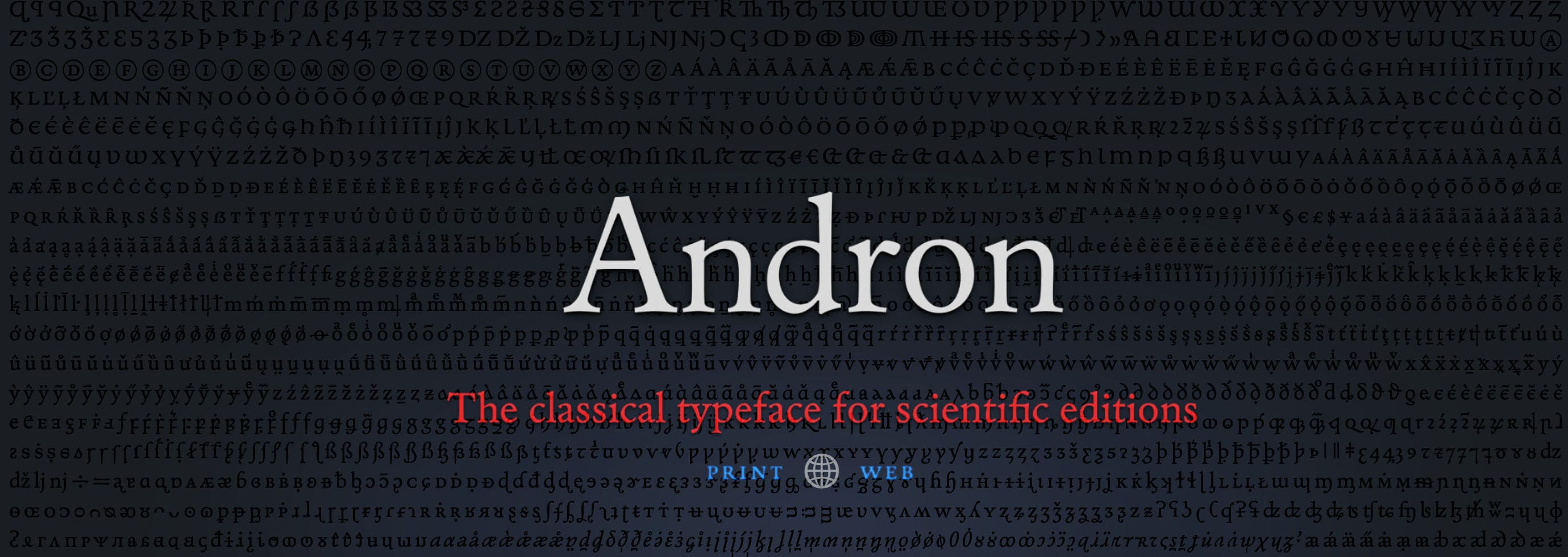
One of Andron’s great strengths is its far-going completenes of even rather unusual character sets. Mainly represented by the Regular font, Andron’s amazing scope of characters is unrivalled by other fonts.

One of the best text fonts ever made
Why you should consider Andron for your institution
To deploy Andron in your projects has a number of advantages for authors, project managers, editors and readers.
- Andron is tried and tested by many ambitious projects, namely academic institutions and reputable publishing houses. With Andron, project leaders can be sure to get the quality and prestige of one of the most acknowledged typefaces of our time.
- As a one-time-only investment it opens limitless possibilities for typographical excellence in all future projects.
- Authors, project leaders and editors can fully rely on complete and comprehensive character sets.
- If some script or characters are still found missing they may well be added to the font package in the near future. To answer user’s character requests is part of our long-term support policy.
- Editors can rely on the premium typographic quality of every single glyph. This ensures the correct semantics being carried in any case, even with unusual or similar glyphs which may get confused.
- Readers will benefit from the top-notch legibility of Andron, because the genes of Andron root in more than 500 years of experience in manuscript scholarship and letterpress craftsmanship.
